
Ask most people what keeps a network safe, and they'll point to firewalls, VPNs, or maybe a clever password policy—all of those matter. But spend enough time staring at server logs and traffic dashboards, and you start to realize that a huge part of the job comes down to something far less glamorous: noticing when a number gets bigger than it should.
That's really what threat detection is. It's pattern recognition built on top of comparison. Yesterday you had 4,000 login attempts. Today you have 11,000. Is that a marketing campaign driving traffic, or is it the early shape of a credential-stuffing attack? The raw counts don't tell you much on their own. The change between them does. And measuring change, more often than not, means working in percentages.
The metric everyone uses, but nobody talks about
If you run a website, manage a server, or keep an eye on your home network, you've probably looked at a stat and instinctively asked, "Is that a lot more than usual?" Bandwidth consumption, failed authentication attempts, requests per second from a single IP, the number of unique geolocations hitting your login page — every one of these is a candidate for a sudden, suspicious spike.
The trouble is that our brains are bad at scale. A jump from 50 to 75 feels smaller than a jump from 5,000 to 6,500, even though the first is a 50% increase and the second is only a 30% increase. When you're triaging alerts at two in the morning, that gut-level miscalibration can send you chasing the wrong problem. Converting raw differences into percentages strips out the noise and puts everything on the same footing, which is exactly why it's the language analysts fall back on.
When I'm analyzing a traffic anomaly, I often look at the percentage change between the current activity and the baseline rather than relying solely on raw numbers. A percentage increase calculator, for example, can help quantify changes in traffic volume, failed login attempts, bandwidth usage, or other network metrics. It sounds simple, but expressing changes as percentages makes it much easier to compare events consistently and determine whether a spike is routine activity or something that warrants closer investigation.
Where percentage thinking shows up in practice
Let's get concrete, because "use percentages" is useless advice without context. Here are the situations where this kind of math earns its keep on a real network.
- Detecting traffic spikes by geography: Tools that map incoming connections to their physical location, the kind of IP geolocation lookups this site is built around, become far more powerful when you track them over time. Say 3% of your traffic normally comes from a particular region, and overnight that climbs to 18%. The absolute numbers might still look modest, but the percentage shift is a flashing red light. Geographic baselines only mean something when you can measure how far today's reading has drifted from them.
- Spotting brute-force and credential-stuffing attempts: Failed logins are noisy by nature; people constantly forget passwords. What you care about is the rate of change. A 600% jump in failed authentications from a handful of IP addresses over a thirty-minute window is a very different story from a steady trickle, even if the trickle eventually adds up to the same total. Percentage growth over a short interval is the signal; the daily total is just background.
- Tracking bandwidth abuse: Whether you're worried about a compromised device exfiltrating data or just a misbehaving application chewing through your data cap, the question is the same: how much more is this thing using compared to its normal footprint? A process quietly increasing its outbound traffic by 40% week over week won't trip a hard threshold for months, but the trend is the warning.
- Measuring the impact of a fix: Security work isn't only about catching attacks. After you tighten a rule or deploy a patch, you want proof it worked. If malicious requests dropped by 85% after you blocked a range of addresses, that's a number you can take to your team. Percentages turn "it feels better now" into something defensible.
The baseline problem
Here's the catch that trips up newcomers: a percentage increase is only as meaningful as the baseline you compare against. If your "normal" is itself an anomaly — say you measured your baseline during a holiday lull — then every comparison afterward will look alarming. Garbage baseline in, garbage alerts out.
Good monitoring means establishing what normal actually looks like across different time windows. Traffic on a Tuesday afternoon doesn't resemble traffic at 3 a.m. on a Sunday. Login attempts during a product launch dwarf a quiet week. Smart analysts build several baselines — hourly, daily, weekly — and judge each new reading against the appropriate one. A 200% spike at midnight might be routine if your audience is global and that's peak time somewhere; the same spike against the correct nighttime baseline could be nothing at all.
This is also why unquestioningly trusting a single alert threshold is risky. Static limits ("alert me if requests exceed 10,000") ignore context entirely. Percentage-based, baseline-aware thresholds adapt to the rhythm of your actual traffic, and they're far less likely to drown you in false positives or, worse, stay silent during a slow-burning attack that never crosses an absolute line.
Keeping the math honest
One more practical note, because it's a mistake I see constantly. People mix up percentage increase with percentage of total, and the two answer completely different questions. If attacks went from 100 to 150, that's a 50% increase, but those 150 attacks might still be only 2% of all your traffic. Both numbers are true; they describe different things. Confusing them leads to overreaction or complacency, depending on which way you slip.
Whenever I present figures to a non-technical stakeholder, I try to be explicit about which one I'm quoting and why. "Attack volume rose 50% this week" lands very differently from "attacks make up 2% of traffic," and an honest report usually needs both framings to tell the full story.
The takeaway
You don't need a data science degree to keep a network healthy, but you do need to get comfortable thinking in relative terms. The firewalls, geolocation lookups, and threat feeds are all gathering raw numbers. Turning those numbers into change over time, and being disciplined about your baselines and your definitions, is what separates reactive guesswork from genuine situational awareness.
So the next time a dashboard catches your eye, resist the urge to react to the raw figure. Ask how much it moved, against the right baseline, and let the percentage tell you whether it's noise or something worth your night. More often than you'd expect, that one humble calculation is the difference between catching a problem early and explaining later why you missed it.
Featured Image generated by ChatGPT.
Share this post
Author

Read the latest articles from Olivia
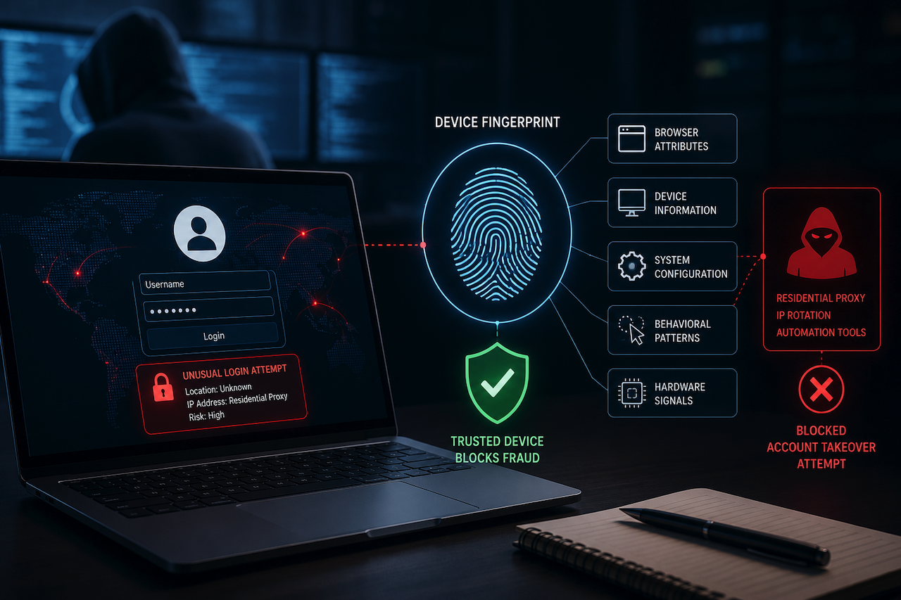
How Device Fingerprinting Stops Account Takeover Fraud
June 15, 2026
Residential proxies are hard to spot. They route traffic through real consumer IP addresses, thereby making a fraudster's connection appear identical to that of a real user. This is where account takeover fraud can occur; attackers have built infrastructure specifically to evade network detection. As a result, be [...]
Learn moreHow to Create AI-Powered Video Ads for Crowdfunding Campaigns in 2026

June 13, 2026
Crowdfunding lives and dies by video. Kickstarter's own data shows that campaigns with video raise 105% more money than those without. On Indiegogo, campaigns with a compelling video are 85% more likely to reach their funding goal. And once your campaign is live, paid video ads on Facebook, Instagram, YouTube, an [...]
Learn moreLeave a comment
All comments are moderated. Spammy and bot submitted comments are deleted. Please submit the comments that are helpful to others, and we'll approve your comments. A comment that includes outbound link will only be approved if the content is relevant to the topic, and has some value to our readers.
Comments (0)
No comment