Micro-animations are the small visual moments that make an interface feel alive. Most users never consciously register them, but remove them and something feels off in a way that's hard to pinpoint. A button that resists slightly before clicking. A form field that gently signals an error. A page transition that doesn't jolt.
They're not decoration. They're the difference between an interface that feels mechanical and one that feels considered.
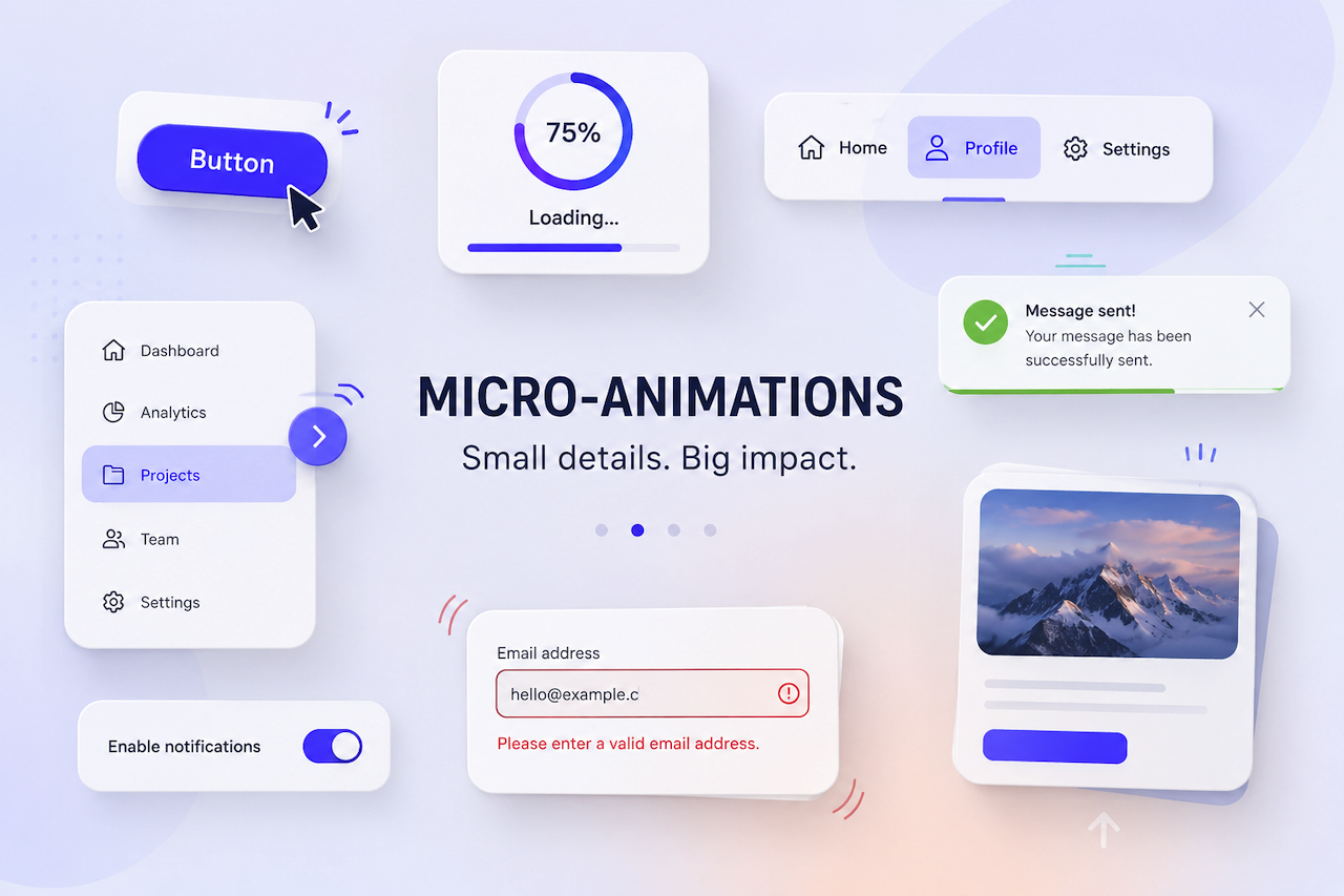
What Do Micro-Animations Actually Look Like?
They show up everywhere, usually quietly. A hover state that subtly shifts a button's color to confirm it's clickable. A loading spinner that appears the moment a form is submitted, so the user knows something is happening. A menu item that eases into place rather than snapping. Individually, none of these feels significant. Together, they shape the entire texture of how a site feels to use.
Why They Matter
The job of a micro-animation is to make interaction legible, closing the gap between a user's action and their understanding of what happened. Interfaces that do this well feel intuitive. Ones that don't tend to leave users second-guessing themselves, wondering whether their click registered or their form actually submitted.
There's also something less functional at play. Interfaces that respond fluidly feel better. Not in a way users can articulate, but in a way that shapes their overall impression of the product. That impression accumulates over time.
The catch is restraint. Micro-animations that overstay their welcome, or run too slowly, or call too much attention to themselves, stop being useful and start being irritating. The goal is for them to feel inevitable, like the interface couldn't behave any other way. This is particularly important for premium digital experiences, where small interaction details influence how users perceive quality and professionalism. A luxury real estate website design agency, for example, may use subtle micro-animations to reinforce a polished user experience without distracting from the properties being showcased.
The Role of Micro-Animations in UX
- Navigation and orientation: Navigating an unfamiliar website is easier when the interface provides spatial cues. Hover states tell users what is clickable, while smooth page transitions help explain where they have moved and why. Without these signals, even a well-structured site can leave users feeling lost.
- Feedback and confirmation: People need to know their actions are registered. A button that responds to a click, a progress bar during a file upload, or a quiet confirmation after a form submission helps prevent users from second-guessing themselves and reaching for the back button.
- Perception and engagement: Motion draws the eye without forcing it. Scroll animations, elements that ease into view, and text that appears rather than snaps into place can give a page a sense of life that static layouts often lack.
- Directing attention: Not everything on a page deserves equal weight. A subtle animation on a banner or call-to-action can surface important content without creating visual noise. Done well, it guides users without interrupting them.
- Emotional response: This effect is harder to measure, but it is real. A playful error animation, a satisfying click state, or a transition that feels physically plausible can communicate that careful thought went into the experience. These small details help build trust in ways that purely functional design often cannot.
Types of Micro-Animations and What They're For
- Hover effects: These are probably the most familiar type of micro-animation. Subtle color, size, or shape changes help confirm that an element is interactive before the user commits to clicking it. Their absence on a clickable element can create genuine confusion.
- Loading indicators: When a system is processing something, users need evidence that something is happening. A spinner or progress bar is not just informative; it is reassuring and helps reduce uncertainty during wait times.
- Micro-transitions: These smooth the edges between interface states. A modal that fades in rather than snapping into existence, or a page that slides rather than abruptly changes, helps preserve the user's sense of location and continuity.
- Form interaction animations: Forms can feel tedious, so small animations help make them more responsive. A field that highlights on focus or an error state that gently shakes instead of simply turning red can make the experience feel more intuitive and less clinical.
- Notifications and alerts: These need to capture attention without becoming disruptive. A banner that slides down smoothly or a toast notification that fades in at the edge of the screen interrupts just enough to be noticed, then quickly gets out of the way.
A Final Thought
The best micro-animations are the ones nobody mentions. Users don't compliment a well-timed hover state or a satisfying form confirmation. They simply feel that the site was easy to use and pleasant to spend time on. That's exactly the point. When micro-animations are working, they disappear into the experience. When they're missing or overdone, the experience itself suffers, and users feel it even if they can't explain why.
Featured Image generated by ChatGPT.
Share this post
Author

Read the latest articles from Roberto Duran
How to Spot AI-Generated Resumes Before They Waste Your Time

June 1, 2026
According to the Resume Genius 2026 Hiring Insights Report, a survey of 1,000 U.S. hiring managers, 80% of them claim they can tell when AI wrote a resume. I keep hearing the same confidence from the founders I work with. "Oh, I can always tell." Maybe. But then they describe what happens next: they notice a [...]
Learn moreLeave a comment
All comments are moderated. Spammy and bot submitted comments are deleted. Please submit the comments that are helpful to others, and we'll approve your comments. A comment that includes outbound link will only be approved if the content is relevant to the topic, and has some value to our readers.
Comments (0)
No comment