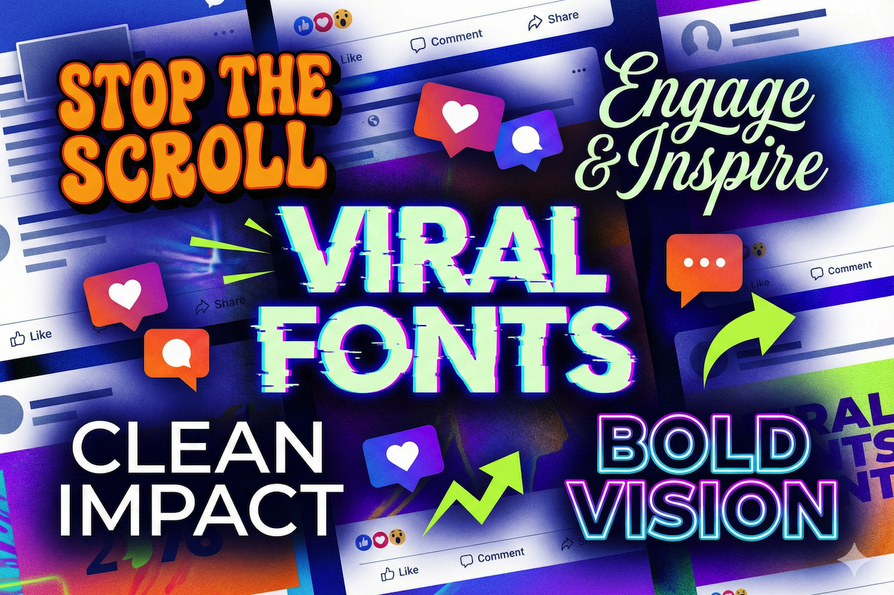
In the busy social media environment, with millions of posts competing to attract attention every second, it has become an art and a science to stand out. Although great content is king, the visual presentation of that content can turn a scroll-past moment into a stop-and-engage moment. Typography is one of the least used but most powerful tools in your social media. The appropriate font type does not merely communicate the words; it communicates character, evokes emotion, and creates an instant visual impression that may change with repeated viewing, turning ordinary viewers into interested followers.
The Psychology of Font Choice
It is important to understand why typography is so significant in the online environment before deciding which font styles to use. Fonts are nonverbal communicators and evoke subconscious reactions in viewers. A geometric, bold, sans-serif typeface looks modern and confident, and a flowing typeface can be associated with sophistication or inventiveness. It has been found that people make judgments about visual content within milliseconds, and typography is a key factor in those judgments.
When scrolling through Instagram, TikTok, or Facebook, people read at a snail's pace amid visual noise. A unique font is a direct indication that your reader will be willing to take a second glance at what you have to say. It generates pattern interruption, one of the marketing principles that terminates the automatic scrolling behavior and draws attention. In addition, consistent use of original typography will build brand awareness, and your posts will be immediately recognized even before readers see your username.
Hot Fonts That Showcase Engaging Designs
Retro and Vintage Fonts
Nostalgia is a very strong emotion, and retro fonts are tapping into its roots. Consider bold, groovy type of the 1970s, Art Deco style of the 1920s, or neon-inspired type of the 1980s. The fonts are particularly effective with lifestyle brands, fashion accounts, and creative businesses. The trick is to ensure that the typography used in the era is paired with the appropriate color schemes and design elements. A sunset gradient with a bubbly, groovy font can halt thumbs in the middle of a scroll, and a gold-and-black Art Deco style with a classic, sophisticated type can't be ignored.
Bold Display Fonts
Subtlety often gives way to boldness on social media. Large, high-impact display fonts with strong visual weight dominate the screen and ensure your message is noticed. These fonts are especially effective for announcements, quotes, and call-to-action posts. Their thickness creates contrast between the letters and the background, making text easy to read even when the image or video is busy. For example, tools like a Tiny Text can help create unique, eye-catching typography that stands out while remaining readable. Use display fonts with distinctive features—such as jagged edges, whimsical lines, or unexpected details—to add personality without compromising clarity.
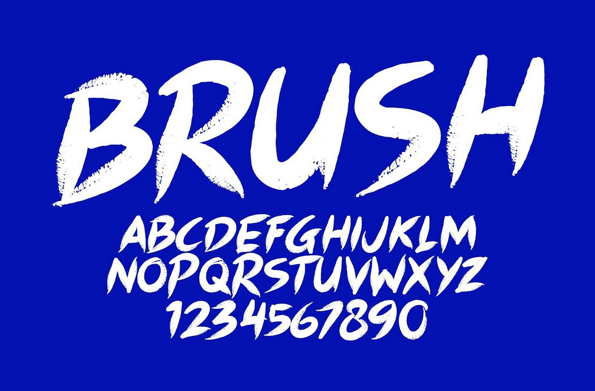
Hand-Lettered and Brush Script Fonts
In a highly digital world, written communication is a touch of reality and human interaction. The brush script fonts and handwritten styles are intimate and friendly, making them the best choice for inspirational quotes, personal branding content, and community-driven messages. These fonts suggest a human touch, which appeals to audiences seeking authenticity. The natural, craft-like texture of handwritten fonts stands in stark contrast to the smooth perfection typically found on social media, making whatever you are saying feel remarkably natural.
Minimalist Sans-Serif Fonts
Although it can be difficult to believe that simple fonts can make content viral, clever, well-designed minimalist typography can produce complex, stunning content. Uniquely proportioned, unquirked clean, geometric sans-serif type offers a cool, high-end look. This technique is effective when applied with negative space, monochromatic color schemes, or bold photography. The lack of complexity allows your message to shine, and the unique aspects of the font provide enough personality to avoid dullness. Luxury brands, wellness accounts, and professional services often use this style to convey authority and sophistication.
Digital Distortion Fonts and Glitch
To appeal to younger audiences or tech-savvy users, glitch fonts and digitally distorted typography can create a cool, in-the-now feel. These fonts convey innovation, disruption, and progressive thinking, which appeals to Gen Z and millennial users. The pixelated or distorted look of glitch fonts demands attention in crowded visual environments. It is therefore best suited to music promotion, gaming settings, tech announcements, and brands that identify as transgressors.
Strategic Implementation for Maximum Impact
The use of unique fonts is just the beginning. The question is whether to use them wisely, and, regardless, this will make the difference between your viral success and failure. These are the main principles to follow:
Readability First, Everywhere
No matter how attractive a font is, if your audience can't read what you are saying in less than two seconds, they'll scroll past. Check your fonts on different devices and screen sizes. As beautiful as it may appear on a desktop, it can look like an eye-catching mess on a mobile screen, where most social media is accessed.
Combine Fonts Wisely
Combining two different fonts, one that is usually used as a headline and the other as body text, will provide visual interest and hierarchy. The difference between a bold display font and a simpler supporting font guides the eye to a specific direction and simplifies information processing. Do not use fonts that are too similar or stylistically incompatible.
Stay Consistent
Consistency is crucial; developing a small set of recognizable fonts or a small set of commonly used typefaces can build trust. Strong brand equity is reached when your posts can be recognized by the typography alone by your followers. You can also consider creating templates using the fonts you select to make content creation easier and ensure consistency.
Consider Platform-Specific Optimization
Visual ecosystems across social platforms differ. Instagram Stories are vertical and often feature bold, large text. One reason Pinterest users react to graphic pins with heavy graphics is the readability of the fonts. High-contrast, chunky fonts are preferable given the fast-paced nature of TikTok and the need to create impact instantly. LinkedIn readers may love more professional and elegant typography. Change the fonts to suit the platform, not the voice.
Font Discovery Tools and Resources
Finding and implementing unique fonts has never been easier, thanks to the abundance of resources available to content creators. Sites such as Google Fonts offer hundreds of high-quality, free typefaces that are commercially available. A wide variety of free and paid innovative marketplaces, including Creative Market, MyFonts, and FontSquirrel, offer unique characters. Design software such as Canva, Adobe Express, and Over has font collections specific to social media content creation. Regarding font choice, it is important to check licensing terms, particularly commercial rights. Although there are many free fonts available for personal projects, using fonts for commercial purposes on social media often requires a commercial license. Licensed fonts help protect your brand, ensure legal compliance, and support the work of type designers.
The Final Word on Typography and Virality
Although there is no magic formula for viral content, font styles will definitely increase your chances of shareability, memorability, and engagement. Typography is the key that connects your message to your audience and, when used wisely, enhances its impact manyfold. The most successful social media developers know that nothing is minor or trivial, including the words they use and the fonts they use to display them. Begin experimenting with fonts, monitor the patterns that draw the most attention, and adjust your style based on the data and feedback. Also, note that trends change quickly on social media, and keeping up with new typographic styles will help you keep your content up to date and relevant. Are you a retro font person, a big-and-bold screens person, or a minimalist? The point is that typography needs to be a true reflection of your brand and resonate with your audience in that decisive moment of scrolling.
Disclaimer
The information provided in this article is for general informational and educational purposes only. While efforts are made to ensure accuracy, the content should not be considered professional, legal, or financial advice. Readers are encouraged to conduct their own research and evaluate tools, services, and strategies based on their individual needs.
This article may contain references or links to third-party websites and external resources. These links are provided for convenience and informational purposes only. IPLocation.net does not endorse, control, or guarantee the accuracy, relevance, or reliability of any external content. IPLocation.net is not liable for any damages, losses, or issues arising from the use of or reliance on external links or third-party services. Use of such resources is at your own risk.
Featured Image generated by Google Gemini.
Share this post
Leave a comment
All comments are moderated. Spammy and bot submitted comments are deleted. Please submit the comments that are helpful to others, and we'll approve your comments. A comment that includes outbound link will only be approved if the content is relevant to the topic, and has some value to our readers.
Comments (0)
No comment