I met a woman last year who'd run her boutique for seventeen years. Same name. Same logo. Same faded pink sign above the door. She called me because sales were slipping and she couldn't figure out why.
"Nothing's changed," she kept saying. "We're the same store we've always been."
That was the problem.
Her customers had changed. Her neighborhood had changed. The way people shop has changed. But she was still wearing the same outfit she'd picked out in 2008, wondering why nobody was complimenting her anymore.
We spent an afternoon walking through her store. She pointed at things she loved. I pointed at things that felt tired. The logo looked like it was designed on a home computer in the 90s. The colors were muddy. The name didn't even make sense anymore; it referenced a location she'd left ten years ago.
She started crying. Not because she was sad. Because she finally saw it. She'd been driving a car with a flat tire for years and just gotten used to the thumping.
The Name That Stopped Meaning Anything
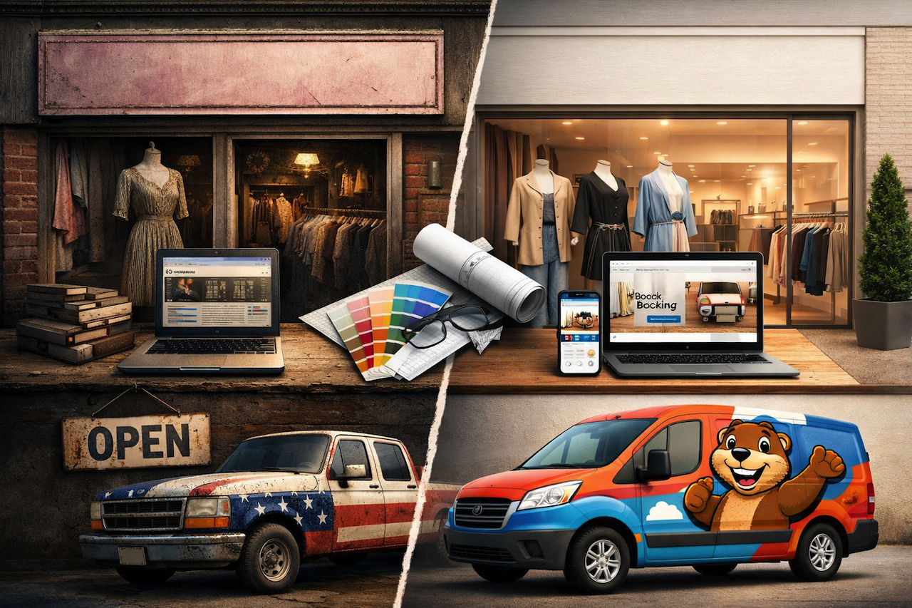
There's a roofing company in Rhode Island that learned this lesson the hard way. They'd been around for fifty years. Good reputation. Solid work. Their trucks were red, white, and blue. Patriotic. Honorable. Honoring the founder's grandfather, who was a WWII veteran.
Then, people started assuming the trucks were political. Some customers flat-out told them they almost didn't call because they thought the vehicles were trying to push a message. A message that had nothing to do with roofs.
Fifty years of work, reduced to a misunderstanding about paint.
They could have ignored it. Kept the name, kept the colors, kept wondering why leads were drying up. Instead, they took a swing. New name. New mascot. A cartoon beaver with big teeth and a goofy smile. Billy the Beaver.
The first week after they wrapped the trucks, they got five leads from people who drove past the same spot where they'd been parked for decades. They used to get maybe ten a year from that spot.
A beaver. Not a flag. Not an eagle. A smiling cartoon beaver with a thumb up. And it worked because it finally matched who they actually were—friendly, approachable, the opposite of intimidating.
That’s what rebranding services are meant to do. They don’t just change how a business looks; they help close the gap between what a company has become and how it’s perceived.
The Website That Still Believes It's 2010
I looked at another business recently. A plumbing company. Good guys. Fair prices. Their website looked like it was built when Obama was first running for office.
Stock photos of people in stiff poses. A contact form that didn't work. No way to book on your phone. The whole thing screamed, "We gave up."
They told me business was slow. I told them their website was the reason.
Here's the thing about website developers who actually understand the market. They know that a website isn't a brochure. It's a front door. If your front door is hard to open, ugly, and squeaks when you push, people don't come in. They go next door.
A good local developer doesn't just write code. They ask questions. Who are your customers? What do they need first? How do they find you? Then they build something that answers those questions before the visitor even thinks to ask.
I sent that plumbing company to a developer I know. New site. Clean. Fast. Big buttons for emergencies. Their calls doubled in three months. Not because they were better plumbers. Because they finally looked like one.
The Handshake Problem
Every business has a first impression. It might be a truck driving down the street. It might be a website loading on a phone. It might be a business card at a networking event.
Most businesses treat these like separate problems. Truck over here. Website over there. Card somewhere else. Nothing matches. Nothing feels connected.
I talked to a guy in Frisco who'd spent twenty grand on a website he hated. Beautiful design. Custom code. It took six months. And he still couldn't explain what his company did without a twenty-minute presentation.
He'd hired the wrong people. He'd hired builders, not thinkers. They asked what he wanted, not who he needed to reach.
The best web design partners don't start with colors and fonts. They start with questions. Who's coming to this site? What do they need? What are they afraid of? Then they build something that answers those things before the visitor even has to ask.
The Fear That Keeps You Stuck
Here's what stops most people. Fear of looking stupid. Fear of losing what little recognition they have. Fear that change will cost too much and deliver nothing.
The roofing company I mentioned spent about $80,000 on its rebrand. New name, new logo, new truck wraps, new signs. That's real money. They worried the whole time. What if nobody likes the beaver? What if we wasted it?
Eight months later, they're expanding into two new states. Leads are up. People take pictures of their trucks. Customers ask for company shirts to wear around town.
Eighty grand looked pretty cheap after that.
The point isn't that you need to spend eighty grand. The point is that doing nothing costs more than you think. Every day you keep the old logo, the broken website, the confusing name, you're losing customers who don't have the patience to figure you out.
The Startup That Changed Everything
There's a healthcare company called Charta that started with a different problem. Great product. Smart founders. Real momentum. But their name? Limo. Got misheard constantly. Didn't match their ambition. Their visual identity was functional but forgettable. They were doing the hard part right—building something real. But without a story that matched the work, they risked being underestimated by customers, by es, by andvestors.
Oh, they changed everything. New name. New story. New look. Not just a logo swap. A full rethinking of who they were and how they'd be seen. Now they've got a brand that actually means something. Founders who can tell their story without tripping. A foundation that'll hold as they grow.
That's the secret. Rebranding isn't about making things pretty. They're about building a foundation that can hold the weight of what you're building.
The Test You Can Run Today
Pull up your website on your phone. Not your computer. Your phone.
Does it load fast? Can you find what matters in two taps? Does it look like it belongs to this decade?
Now look at your logo. Cover the name. Would anyone know what you do?
Now think about the last time someone complimented your branding. When was it? What did they say?
If you're struggling to answer any of these, you already know what needs to happen next.
The Point
You're not the same business you were five years ago. Your customers aren't the same people. The way they search, shop, and decide isn't the same.
The only question is whether your brand has kept up.
Sometimes that means new trucks and a cartoon beaver. Sometimes it means a website that actually works on a phone. Sometimes it means a name that finally says what you mean.
Whatever it takes, the cost of changing is almost always less than the cost of staying the same.
Featured Image generated by ChatGPT.
Share this post
Author

Leave a comment
All comments are moderated. Spammy and bot submitted comments are deleted. Please submit the comments that are helpful to others, and we'll approve your comments. A comment that includes outbound link will only be approved if the content is relevant to the topic, and has some value to our readers.
Comments (0)
No comment