Presentations should be attractive, simple, and easy to understand. But rows of Excel data can be a mess. In this situation, you may have valuable insights right before you, but they might get ignored if they aren’t presented well. That’s where visual reports come in.
A well-crafted visual report turns boring spreadsheets into a compelling narrative of the whole organization's information. So, how does your Excel data turn into a striking visual report?
Let’s read the easiest way!
Type of Data
First of all, you should examine the type of data you have (categorical, numerical, time-series, etc.) and what you want to convey before creating any visuals. Like, whether you are comparing categories, showing trends, or highlighting outliers. Thus, you can tailor visualization according to your audience’s needs—executives may want high-level summaries, while analysts may need more granular detail.
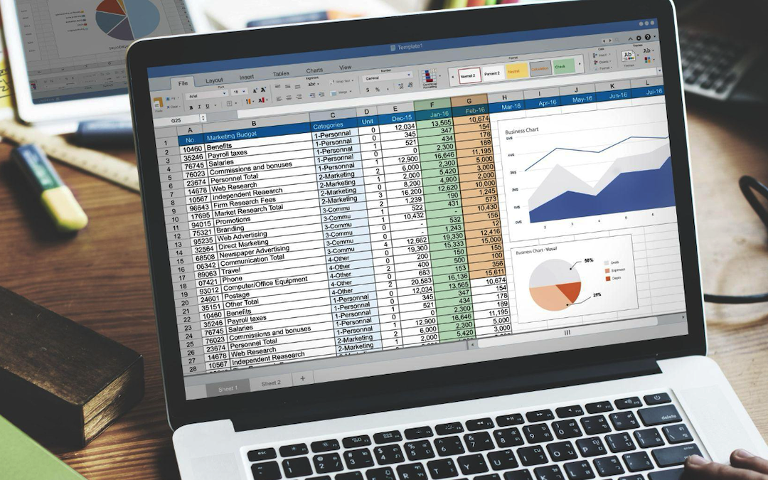
Chart Type
Excel has a variety of options, and each one serves a different purpose, so selecting the appropriate chart can be a bit challenge:
- Bar and Column Charts are best for comparing categories.
- Line Charts are preferred for showing trends over time.
- Pie Charts are useful for displaying proportions of a whole, but should be used sparingly.
- Scatter Plots reveal relationships between two numerical variables.
- Heat Maps highlight patterns or outliers using color gradients.
- Waterfall Charts show the cumulative effects of sequential values.
Do a wise analysis that matches the chart type to your data and your communication goal.
Visual Design Principles
A striking visual report is not only about the chart type. Some important aspects need to be aligned as well:
- Simplicity: Just focus on the data that matters. Remove unnecessary parts, gridlines, and chart junk.
- Clarity: You should use clear axis labels, descriptive titles, and concise legends. That makes sure viewers can interpret the chart in seconds.
- Consistency: Try to use the same colors and font style throughout the whole report, and add different colors only where you want to highlight something important.
Excel Advanced Features
Excel provides advanced features to improve your visuals:
- Conditional Formatting: You have access to color scales, data bars, and icons to highlight trends, outliers, or thresholds directly in your tables.
- PivotTables and PivotCharts: Having the feature through you can quickly summarize large datasets and create interactive visuals for comprehensive exploration.
- Dashboards: It combines multiple charts and slicers for interactive reporting at a single glance.
Templates to Save Time
You don’t have to make a layout every time if you often create reports, as it can be tiring. Instead, just confirm a well-established template with pre-set fonts, colors, and chart styles. Excel allows you to save charts as templates, so you don’t have to redo the design every time. This also ensures your reports stay consistent in style, which is crucial for the influence of any team on analysts.
Tell a Story
Persuasive data visualization should be like storytelling, which can grab the viewers. For which you have to arrange your visuals in a logical sequence – begin with a summary, drill down into details, and highlight important insights or recommendations. You also have the option of annotations or callouts to draw attention to important findings.
Descriptive Text Boxes for More Clarity
Moreover, you can add short descriptive text boxes next to your charts instead of relying on labels or legends. For example:
“Sales dipped in Q2 due to supply chain issues.”
This shares the audience's immediate insight without guessing what the chart is trying to express. That’s how it can highlight a more human touch to the data.
Avoid Common Pitfalls
- Don’t mess your charts with too much information.
- Avoid misleading scales or chart types that distort the message.
- Always provide context so viewers can understand what they’re seeing.
Design for Mobile Viewers
Most people view reports on mobile devices, especially when shared via email or messaging platforms. Thus, consider the following to improve readability:
- Use larger font sizes
- Concise the number of elements per chart
- Stack visuals vertically for easy scrolling.
These small changes can turn your reports more user-friendly for on-the-go readers.
Share and Export Your Visuals
At last, you need to share visuals clearly after finishing the report. Excel lets you save charts as PDFs or images. Alternatively, tools like Excel to JPG help you transform your charts and tables into clear JPG images. This makes it a smooth procedure to add them to slides, websites, or social media without losing quality.
Conclusion
A professional visual report takes more than just adding charts. You have to portray data logically, choose the right charts, design them clearly, and try to symbolize it like a story with your visuals. You can make reports that are helpful, eye-catching, and easy to share by following smart tips provided in this article.
Share this post
Leave a comment
All comments are moderated. Spammy and bot submitted comments are deleted. Please submit the comments that are helpful to others, and we'll approve your comments. A comment that includes outbound link will only be approved if the content is relevant to the topic, and has some value to our readers.
Comments (0)
No comment