Creating a logo might seem like a small part of building your business, but it plays a much bigger role than people often think. Your logo is one of the first things people notice about your brand. It helps them remember you, and it can even shape how they feel about your products or services. A great logo can stick in someone’s mind, while a bad one might be forgotten right away.
If you want your logo to truly reflect your brand, you’ll need to go through a thoughtful process. It's not just about making something that "looks good." Your logo should tell people who you are, what you offer, and what kind of feeling they can expect when they interact with your business. Below are some clear steps you can follow to create a logo that truly matches your brand.
Understand What Your Brand Stands For
Before you start sketching ideas or try to pick colors, you need to understand your brand fully. Ask yourself: What does your business do? Who is your target audience? What values do you stand by? When you understand the answers to these questions, it becomes easier to think of a design that represents all of that.
Think about the mood you want your logo to give off. Is your brand fun and playful or serious and professional? Do you want to attract young people or adults? Is your service affordable or more high-end? These things matter a lot when it comes to choosing the right logo style, shapes, fonts, and colors.
Do Research on Competitors
A smart step in creating your logo is to look at what others in your field are doing. Check out the logos of your competitors or businesses that are similar to yours. You don’t want to copy anyone, but studying what works (and what doesn’t) can give you useful ideas. It can also help you figure out how to make your own logo stand out.
When looking at other logos, pay attention to what type of design they use. Are they modern and simple or full of details? What kind of fonts do they go for? Do they use lots of colors or just one? These details can help you find your own style while also making sure your logo doesn’t look too much like someone else’s.
Pick the Right Style and Feel
Once you’ve done your research and understand your brand, it’s time to decide on a logo style. There are many types: some are just text, some use icons, and others combine both. What works best for you depends on your brand’s personality. A tech startup might use a simple wordmark, while a bakery might want an image included.
The style of your logo should match your business tone. If your brand is casual and fun, you can use soft colors, friendly fonts, and round shapes. If it’s more professional or formal, go for sharp lines, clean fonts, and neutral tones. This way, your logo will feel like it “fits” with everything else your business does.
Choose Colors That Match Your Message
Color is one of the most powerful parts of any logo. People often connect certain colors with specific feelings. For example, blue can feel calm or trustworthy, red can feel exciting or bold, and green is often connected to nature or health. Choosing the right colors can help your logo send the right message.
Try not to use too many colors—two or three is often enough. Also, make sure your logo works in black and white. Sometimes, your logo will be printed without color, so it should still look good, even without all the extras. This helps keep your design simple and effective no matter where it appears.
Pick Fonts That Represent Your Brand
Fonts might not seem that important, but they actually say a lot about your business. A fancy script font might work well for a beauty brand but not for a sports store. A thick, bold font could be perfect for a tech company, but it might look too heavy for a small café. Matching the font to your brand’s tone is key.
Keep it simple. Don’t use more than two fonts in your logo, and make sure they are easy to read. If people can’t tell what your logo says, it won’t help your business. Try different combinations until you find one that feels just right for the look and voice of your company.
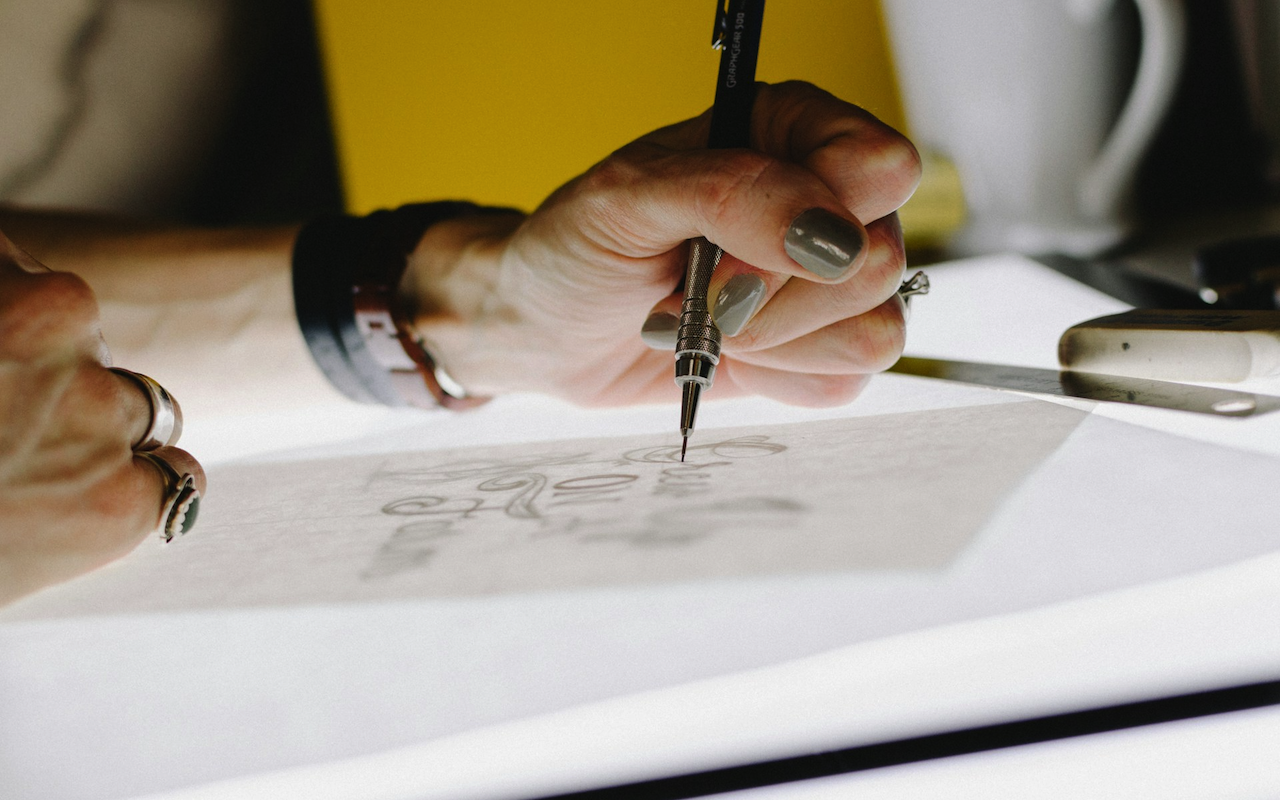
Sketch and Try Out Different Ideas
Even if you’re not an artist, sketching a few rough ideas can help you get started. You don’t need to be perfect—just get your thoughts on paper. Try out different shapes, styles, and layouts. Sometimes, an idea that doesn’t seem great at first turns into the best one after a few changes.
You can also use free online logo makers to test different looks but don’t rely only on them. These tools are great for practice, but they can’t give you something truly original. If you want something custom that truly fits your brand, it’s often helpful to search for terms like ‘logo designer near me’. This will give you access to a range of options. Shortlist a reliable designer who understands your style and audience. This will offer you something unique that sets you apart from others.
Get Feedback from Real People
Once you have a few ideas, show them to people you trust. Ask your friends, family, or even loyal customers what they think. Be open to their opinions—sometimes, others can see things that you might have missed. Make sure to ask if the logo makes sense and matches your brand’s style.
Try not to take negative feedback too personally. The goal is to make your logo better, not to protect your first idea. If several people are confused by something in your design, it’s probably a sign that you need to fix it. Don’t be afraid to make changes and test different versions.
Think About Where Your Logo Will Be Used
Your logo won’t just appear on your website. It will also show up on your products, business cards, packaging, signs, and maybe even on clothing or vehicles. So, your design has to look good in all sizes—big and small. A logo that looks great on a website might not look as good on a tiny label.
Before you decide on a final design, test your logo in a few different formats. Shrink it down to see if it’s still clear. Print it out in black and white to see if it still works. You want to be sure that your logo will always look professional, no matter where it appears.
Keep It Simple, But Make It Strong
One of the best logo tips is to keep things simple. A complicated logo might look cool, but it’s harder to read and harder to remember. Simple logos, like the ones from Nike or Apple, are often the most effective. They are easy to spot and don’t rely on a lot of detail to make an impression.
This doesn’t mean your logo has to be boring. You can still be creative—just make sure it’s clear. One smart shape, one good color combo, and one strong font are usually more than enough. A simple, powerful logo helps people remember your brand better.
Final Thoughts
Creating a logo that truly defines your brand takes time and effort, but it’s worth it. Your logo will represent you everywhere, so make sure it feels like the right fit. Start by understanding your brand, then move on to the fun stuff, like choosing styles, fonts, and colors. Test different ideas, listen to feedback, and make smart choices.
Whether you’re making your own or working with a pro, your goal should be to create a logo that your customers can recognize and trust. A good logo doesn’t just look nice—it tells your brand’s story in a simple and strong way.
Featured Image by Unsplash.
Share this post
Leave a comment
All comments are moderated. Spammy and bot submitted comments are deleted. Please submit the comments that are helpful to others, and we'll approve your comments. A comment that includes outbound link will only be approved if the content is relevant to the topic, and has some value to our readers.
Comments (0)
No comment