We come across dashboards every day. It is a visual and effective tool for marketers, business analysts, project managers, HR specialists, and scientists. Let's look at how to use dashboards, what they are like, and how they differ from other methods of data visualization. Let's look at the basic tools for creating dashboards.
What is a dashboard?
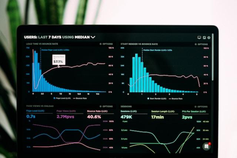
In simple words, a dashboard is an interactive analytical panel, a graphical interface. The point is that all key metrics, goals, or process indicators are located on one screen. Using these metrics, trends, and changes can be identified and analyzed. We come across dashboards every day. A dashboard in a car or activity graphs in a fitness bracelet app are all dashboards.
From year to year, dashboards change and are modernized. Their design changes according to modern trends. The interface and possibilities of use are changing. If you are involved in the development and creation of dashboards or want to start doing this, then you should familiarize yourself with Dashboard Design Trends for 2024. This will help you create a popular product that will be convenient for modern users.
Types of dashboards
There are three main types of dashboards, but they can be combined with each other:
- Analytical: helps to explore trends and draw conclusions. They are usually created for a specific business unit. Analysts work with them to record deviations in indicators and track the causes. An example is the development of a dashboard about changes in the number of users of a specific product per week. With its help you can see the average bill, the share of customers, and the percentage of turnover for each of the competitors;
- Strategic: needed to get an idea of the situation as a whole or about individual indicators, identify problems, and help to correct them. For example, creating a dashboard about staff loyalty will help you understand the degree of employee loyalty and track its changes among different groups
Differences between a dashboard and a report and infographics
A dashboard is different from an infographic. Infographics are simplified data visualization for non-specialists and ordinary users. It is suitable only for simplified and visual presentation of information. Dashboard is a working tool for specialists. Typically these are metrics on a single screen, the visualization of which can be controlled. Using a dashboard, you can identify trends and determine what factors caused them. Most popular admin panels provide a dashboard for the overall activities of the business.
It is important not to confuse dashboards with reports: reports record data state during a certain period. Dashboards change automatically, they are dynamic and interactive, so you don’t need to create them again. It is enough to create a dashboard once and then constantly use this tool to track changes.
Creation Tools
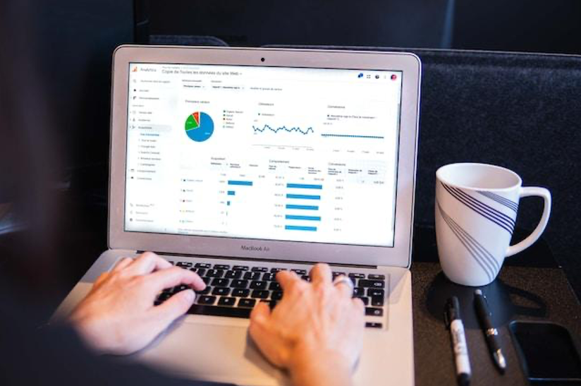
How to make a dashboard? Basic functions for creating them are available in Microsoft Excel or Google Sheets. Whatever tool you choose, there are a few universal rules that you need to follow to create an effective dashboard:
- Select important data. Select the data sources you plan to display in advance. To do this, when building dashboards, you need to take into account what decisions will be made with their help, what data is needed for this, and in what logic you will place them;
- Think over the structure of the dashboard. Basic information should be presented at the top of the page, and less important and detailed information should be presented below. Alternate different visualization elements to make it easier to visually perceive information. Remove unnecessary elements so as not to confuse the user;
- Select metrics and visualization elements. The indicators and metrics you will use in the dashboard must be chosen in advance, as well as the method for visualizing them. Label the graphs and highlight segments on the diagram with different colors. It is important that all graphs and tables are as clear as possible. To do this, use different types of widgets to make it easier to understand. Place them in order of importance: the higher the widget is located, the more significant it is for the user;
- Personalize content. The dashboard content needs to be configured and customized to suit the needs of users so that they can change display parameters. For example, select the desired time – day, week, month, year, or any other period.
Conclusion
Dashboards are irreplaceable assistants we work with almost constantly but don’t even think about it. Interestingly, they are constantly being developed, and dashboard developers are highly valued. The main thing is to be able to use the software and follow the rules for creating it.
Share this post
Author

Leave a comment
All comments are moderated. Spammy and bot submitted comments are deleted. Please submit the comments that are helpful to others, and we'll approve your comments. A comment that includes outbound link will only be approved if the content is relevant to the topic, and has some value to our readers.
Comments (0)
No comment