
According to StatCounter Stats, mobile devices account for approximately 53.91% of global web usage while desktops and tablets account for approximately 44.1% and 1.99% respectively in April 2023. This means that more than half of all internet users are accessing the web through their smartphones making it crucial for websites to be optimized for mobile devices.
It is worth noting that the stats can vary depending on the region and industry. For example, developing countries may have a higher percentage of desktop users than mobile users due to internet accessibilityy and affordability issues. Also, some industries may have a higher percentage of mobile users than others due to convenience and portability. Nonetheless, the trend towards mobile usage is clear, and it's important for websites to prioritize responsive design and mobile optimization in order to provide the best possible user experience for the majority of internet users.
What is responsive web design?
Responsive web design is a web design approach that can adapt layout and content to fit different screen sizes and devices. The goal of responsive design is to create a "single" layout that provides a seamless user experience regardless of the device being used to access the website.
In responsive design, designers use flexible grids, image compression, and media queries to ensure that the website's content is displayed optimally on any screen size. This means that the website's layout and content will adjust automatically based on the device's screen size and orientation.
Responsive web design is essential in today's world, where people access the internet using a wide range of devices. With responsive design, websites can provide an optimal user experience on any device, which is crucial for ensuring that users can easily access and navigate the site, regardless of the device they're using.
Why do you need a responsive website?
Responsive web design is essential for several reasons:
- Improved User Experience: With the increasing use of mobile devices, users expect websites to work seamlessly on any device they use. Responsive web design ensures that the website adapts to the screen size, making it easier for users to navigate and consume content on any device.
- Increased Reach: With the rise of mobile devices, more and more people are accessing the internet on their smartphones and tablets. A website that is not optimized for mobile devices may lose potential customers, as they will likely leave the site if they have a poor user experience.
- Better SEO: Search engines use mobile-friendliness as a ranking factor. A responsive website is easier for search engines to crawl and index, leading to better search engine rankings and increased visibility.
- Cost-Effective: Responsive web design eliminates the need to create separate websites for different devices, which can be time-consuming and costly. A single responsive website can provide an optimal user experience on any device, saving time and money.
What are the most popular screen sizes and resolutions?
The most popular screen sizes and screen resolutions vary depending on the device and the region where they are used. Here are some of the most common screen sizes for different devices:
- Desktop Computers: The most popular screen sizes are 21 inches, 24" and 27" monitors with 32" and higher sizes gaining demand. The widely used screen resolution for desktop computers is 1920x1080 (1080p), followed by 1366x768 and 1440x900. In recent years, larger 2K (2560x1440p) and 4K (3840x2160) resolutions are also gaining popularity on desktop computers.
- Laptops: The most common laptop screen sizes are 13.3 inches, 14 inches, and 15.6 inches. The common screen resolutions used are 1920x1080, 1366x768, 1280x800, 1440x900, and 1600x900.
- Tablets: The most popular tablet screen sizes are 7 inches, 8 inches, and 10 inches. Apple's iPad Pro introduced 11" and 12" screen sizes. The popular screen resolutions used by tablets are 2048x1536 (iPad models), 1920x1200, 1280x800, 2560x1600 (Samsung Galaxy Tab models), and 1024x768 resolutions.
- Smartphones: The most popular smartphone screen sizes are around 6 inches or smaller, with 5.5 inches being a common size. However, many high-end smartphones now have larger screens of 6.5 inches or more. The popular resolutions used are 1080x2340, 720x1280, 1440x2960, 750x1334, and 1080x1920.
It's important to note that these screen sizes are constantly evolving, and new devices with different screen sizes are regularly being released. As a result, responsive web design should focus on adapting to a wide range of screen sizes, rather than targeting specific sizes.
What is viewport and how do you use it to design a responsive web page?
The viewport is a virtual area on a web page that represents the visible portion of the website on the user's device screen. It is important to consider the viewport when designing a responsive website because it determines how the website content will be displayed and how users will interact with the site on different devices.
To design a responsive site using the viewport, here are some steps to follow:
- Set the viewport meta tag: In the head section of the HTML document, you should include a viewport meta tag to specify the width and initial scale of the viewport. The tag should look something like this:
<meta name="viewport" content="width=device-width, initial-scale=1.0">
This tells the browser to set the viewport width to the device width and to set the initial scale to 1:1. - Use CSS media queries: CSS media queries can be used to adjust the layout of the website depending on the width of the viewport. For example, you might use a media query to display a different layout for devices with a screen width of 768 pixels or less.
@media only screen and (max-width: 768px) { /* styles for devices with a screen width of 768px or less */ } - Use fluid and flexible design: Instead of using fixed widths and heights for elements on the website, use a fluid and flexible design that adapts to the size of the viewport. For example, you might use percentage-based widths instead of pixel-based widths, or use a responsive grid system that adjusts to the viewport size.
By using viewport, you can create a responsive website that looks and functions well on a variety of devices and screen sizes.
Responsive design for images?
Responsive design for images is an important aspect of creating a website that works well on a variety of devices and screen sizes. Here are some considerations for the responsive design of images:
- Image size: The size of an image can have a big impact on how long it takes to load. For example, an image that looks good on a large desktop monitor may be too \slow to load on a mobile device with a slower internet connection. Therefore, it's important to optimize image sizes for mobile devices to ensure fast load times.
- Image resolution: The resolution of an image can have a big impact on how it appears on different devices. For example, an image may be too large on mobile devices even though it may look good on a desktop computer with a larger screen size.
- File formats: Different file formats are better suited for different types of images and devices. For example, JPEG images are best for photographs and complex images with lots of colors, while PNG images are better for simpler images with fewer colors and transparent backgrounds. SVG images are best for icons and other graphics that need to scale smoothly to different sizes. Choosing the right file format can help reduce file size and improve image quality on different devices.
- Image compression: Images should be compressed to reduce file size and improve load times, but without sacrificing image quality. There are several techniques for image compression, such as lossy compression and lossless compression, that can be used to strike a balance between file size and image quality.
- Lazy loading: Lazy loading is a technique that allows images to load only when they are needed, such as when the user scrolls down to that part of the page. This can improve page load times and reduce the amount of data that needs to be downloaded, especially on mobile devices with slower internet connections.
- Responsive images: Responsive images are images that can adapt to different screen sizes and resolutions. One common technique for creating responsive images is to use the "srcset" and sizes attributes in HTML, which allow the browser to choose the most appropriate image based on the user's device and screen size.
Images play an important role in HTML, and implementing responsive design techniques for images will help website owners to create a website that looks great and performs well on a variety of devices and screen sizes.
Responsive design for video displays
Responsive design for video displays is a technique that allows video content to be optimized for a variety of screen sizes and resolutions, from small mobile screens to large desktop monitors and even ultra-high-definition (UHD) displays. Responsive video design typically involves using HTML5 video and CSS to control the size, aspect ratio, and playback options of the video content.
One common approach to responsive video design is to use media queries to detect the size and resolution of the user's screen and adjust the video playback accordingly. For example, a website may display a smaller, lower-resolution video for mobile users and a larger, higher-resolution video for desktop users. Another approach is to use adaptive streaming technologies, such as HTTP Live Streaming (HLS) or Dynamic Adaptive Streaming over HTTP (DASH), which automatically adjust the video quality based on the user's internet connection and device capabilities.
Other considerations for responsive video design include optimizing the video file format and compression settings for different devices and screen resolutions, providing alternative video formats for users with slower internet connections or older devices, and ensuring that the video controls and captions are easily accessible and usable on all devices.
Conclusion
Responsive web design is an approach that aims to create websites that adapt and respond to different devices and screen sizes. It involves designing and developing websites in a flexible and fluid manner, utilizing techniques such as media queries and flexible grids. The goal is to provide an optimal user experience by ensuring that the website's layout, content, and functionality adjust seamlessly across various devices, whether it be desktop computers, laptops, tablets, or smartphones. Responsive web design allows for improved usability, increased reach, better search engine visibility, and cost-effectiveness by eliminating the need for separate designs for different devices.
Share this post
Author

Read the latest articles from Scott Seong
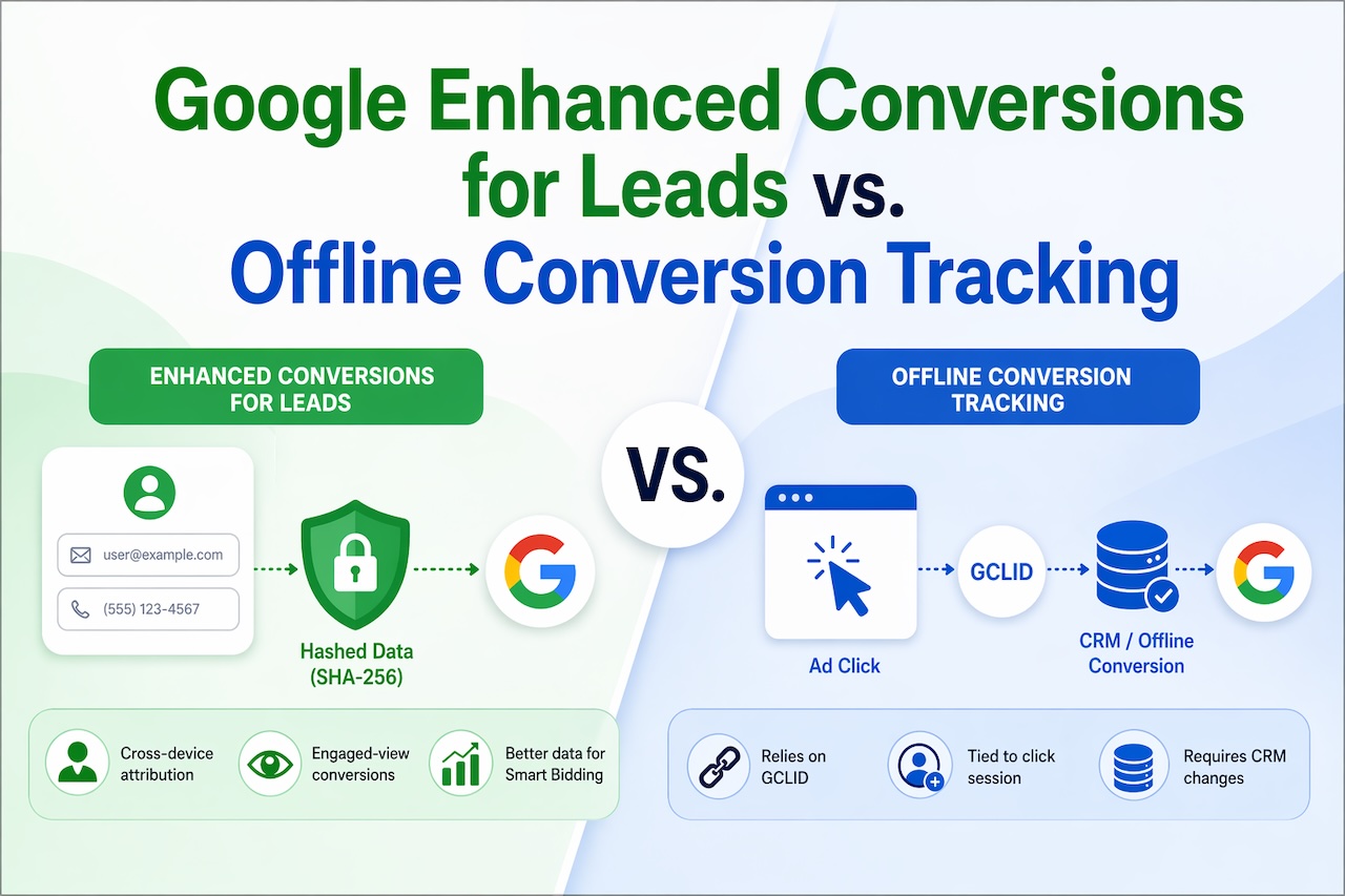
What are the differences between Google Enhanced Conversions for Leads vs. Offline Conversion Tracking?
April 24, 2026
These two features solve the same fundamental problem — lead gen advertisers can't see what happens after someone fills out a form — but they use different mechanisms to do it. Think of Offline Conversion Tracking (OCT) as the original solution, and Enhanced Conversions for Leads (EC4L) as its upgraded replac [...]
Learn moreAffiliate Marketing Explained: How to Turn Traffic into Revenue

April 15, 2026
Most people think making money online requires building a product, running ads, or managing a full business. But there’s another path that’s far more accessible—and often overlooked. Affiliate programs allow you to earn by simply connecting people with products or services they’re already interested in. Learn more
Leave a comment
All comments are moderated. Spammy and bot submitted comments are deleted. Please submit the comments that are helpful to others, and we'll approve your comments. A comment that includes outbound link will only be approved if the content is relevant to the topic, and has some value to our readers.
Comments (0)
No comment