Cursive fonts bring forth a distinctive allure and adaptability that can infuse projects with a sense of grace and individuality. Using the cursive alphabet in text lends it a human touch and a warm, connected feel, making it particularly appealing.
Here's a closer look at why cursive fonts are beloved and their diverse range of applications.
- Elegance in Every Stroke: Cursive fonts are popular for their graceful and fluid strokes. The sweeping lines and curves create a timeless and stylish design that has the appearance of being handcrafted with artistry.
- Personal Touch: One of the most appealing aspects of cursive fonts is the personal touch they convey. Unlike standardized fonts, cursive allows for a more special and individualized expression, making it an excellent choice for personal projects and creative endeavors.
- Expressive and Romantic: Cursive fonts often carry a romantic and expressive quality. The natural flow of letters can convey emotions and sentiments in a way that feels genuine and heartfelt, making them perfect for invitations, love letters, and special occasions.
- Versatility Across Designs: Cursive fonts are versatile and can adapt to various design contexts. These fonts improve branding, graphic design, and digital media presentation by blending seamlessly with various visual elements, adding sophistication.
- Historical Allure: Rooted in centuries of handwriting traditions, cursive fonts carry a historical allure. Their timeless design utilizes modern and past elements, making them an appealing choice for projects aiming to combine memories with modernity.
- Emphasis on Creativity: Cursive fonts provide ample room for creativity and experimentation. Designers can play with different styles, flourishes, and ligatures, allowing for the creation of custom fonts that suit specific themes or moods.
- Readability in Context: Cursive fonts, despite their ornate appearance, are designed for readability and can enhance text readability when used appropriately and in appropriate contexts.
How creating your font can add a personal touch to projects
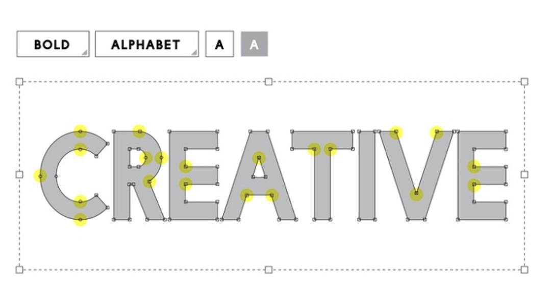
Creating your font is a rewarding project that goes beyond mere design; it allows you to include a unique and personal touch into your projects. Here's why and how crafting your font can elevate your work to new levels of individuality and creativity.
- Uniqueness: One of the primary advantages of designing your font is the opportunity to create something truly unique. Your font becomes a visual signature, setting your work apart from the sea of standard fonts and giving it a specific personality.
- Customizing to Project Themes: When you create your font, you have the flexibility to adjust it to the specific theme or mood of your project. Your choice of font can strengthen and clarify the intended message in any kind of writing, be it a creative piece, a personal blog, or a professional presentation.
- Reflecting Your Style: Fonts are a form of artistic expression, and by designing your own, you have a canvas to reflect your style. Your font becomes a further expression of your creative style, whether you like simple lines, silly curls, or complex details.
- Consistency Across Branding: For businesses and personal brands, a custom font ensures consistency in visual identity. The font can seamlessly integrate with your logo, color scheme, and branding strategy, fostering a cohesive and memorable brand image.
- Spiritual Connection: Creating your font allows you to establish a deeper emotional connection with your audience. The time and effort invested in crafting a custom font demonstrate a level of care and dedication that can resonate with those who interact with your work.
- Flexibility and Adaptability: Your font is entirely in your hands, offering flexibility for future projects. Need a variation for a special occasion or a modified version for a different medium? With your font, you can adapt and evolve as your creative needs change.
- Storytelling Through Design: Fonts tell a story, and when you design your own, you're the storyteller. Aspects of your story, such as a sense of professionalism, playfulness, or nostalgia, can be communicated through every curve, loop, and serif.
- Engaging User Experience: For digital projects, a custom font contributes to a more engaging user experience. Users encountering a unique font may find the experience more memorable, enhancing the overall impact of your website, app, or digital publication.
- Creative Exploration: Font creation is a journey of creative exploration. It encourages experimentation with design elements, allowing you to push boundaries and discover new possibilities in typography.
- Sense of Achievement: Finally, the process of creating your font is an accomplishment in itself The sense of pride and ownership that comes with using a font you designed can fuel your passion for design and motivate you to take on more ambitious projects
World of Cursive Fonts
Step into the captivating world of cursive fonts, where letters dance gracefully, creating an artful tapestry of the script. Cursive fonts, also known as script or handwriting fonts, carry a timeless charm that transcends eras. These fonts, characterized by their interconnected letters, resemble hand-written script elegance, each curve and loop showcasing craftsmanship and creativity.
Cursive fonts have a rich history, drawing inspiration from various calligraphic traditions. Cursive fonts, known for their delicate strokes and fluid connections, are versatile and popular for various applications, including formal invitations and creative projects.
Digitally, cursive fonts have evolved, blending traditional charm with contemporary design elements, creating a diverse range of styles catering to various tastes and purposes.
Cursive fonts, known for their design appeal and emotional evocation, are often used in romantic wedding invitations, quotes, and nostalgic branding to add warmth and humanity to written text.
Explore the world of cursive fonts, each telling its own story and allowing creativity with a digital stylus. Enjoy classic and modern scripts and typography artistry.
What defines cursive fonts and their unique characteristics
Cursive fonts identify themselves through a seamless flow of interrelated letters, creating a graceful and continuous script. These fonts, which use ligatures, use special characters to improve smooth transitions, and variations in stroke thickness add dynamic visual interest.
Often presented at a slight angle, cursive fonts exude a calligraphic elegance, further adorned with decorative flourishes and swirls. The intentional mimicry of handwritten imperfections adds a personal touch, fostering a sense of organic authenticity.
Open loops, stylistic elements, and a calligraphic influence contribute to the diverse and expressive nature of cursive fonts. In pith, these fonts capture the artistry of beautiful writing, offering a timeless and versatile option in the vast realm of typography.
Examples of popular cursive fonts and their applications
Cursive fonts come in a diverse array of styles, each with its unique personality and charm. Here, we explore examples of popular cursive fonts and the broad spectrum of applications where they shine:
1. Lavanderia: Elegant and sophisticated
Ideal for wedding invitations, formal event materials, and high-end branding, Lavanderia adds a touch of timeless grace to projects that demand a refined aesthetic.
2. Pacifico: Playful and casual
Perfect for creative projects, Pacifico injects a sense of fun into designs. It's often used in informal invitations, children's book covers, and branding for quirky, lighthearted businesses.
3. Brush Script MT: Casual, with a handwritten feel
A classic choice for a variety of applications, Brush Script MT is versatile and works well for greeting cards, informal signage, and personalized stationery.
4. Snell Roundhand: Elegant and traditional
Commonly chosen for formal invitations, Snell Roundhand exudes sophistication. It's also favored in the design of certificates, diplomas, and other documents requiring a touch of classical elegance.
5. Dancing Script: Contemporary and Dynamic
With its lively and modern feel, Dancing Script is often used in digital media, websites, and branding for businesses that want to convey a sense of energy and movement.
Tips for Ensuring Readability in Your Cursive Font
Creating a cursive font that is both visually pleasing and easy to read requires careful consideration of various design elements. Here are some essential tips to ensure the readability of your cursive font:
1. Balanced Letter Spacing
Maintain consistent and well-balanced spacing between letters to prevent crowding or excessive gaps. Proper letter spacing helps to a smooth flow and enhances legibility.
2. Clear Distinction Between Characters
Make sure that each character can be distinguished clearly from the others to prevent confusion. Even in a flowing cursive script, readers can quickly recognize each character thanks to distinctive letterforms.
3. Adequate Size and Thickness
Choose an appropriate font size and stroke thickness to ensure that the text remains legible across different mediums. Readability may be limited by strokes that are too thin or small, particularly in smaller text.
4. Mindful Use of Ligatures
While ligatures can enhance the natural flow of cursive fonts, use them sensibly. Overusing ligatures may compromise readability, so strike a balance to maintain clarity in the text.
5. Consideration of Context
Tailor your cursive font to the intended context and purpose. A more ornate and stylized font might be suitable for creative projects, but for practical applications like body text, a more straightforward design may be preferable.
6. Openness and Accessibility
Design characters with open loops and clear connections to promote readability. Avoid overly intricate or closed forms that might obstruct the flow and make it challenging for readers to distinguish letters.
7. Testing Across Platforms
Ensure your cursive font retains its readability when used across various platforms and devices. Test your font in different sizes and on different screens to confirm its legibility in diverse settings.
8. Feedback and Iteration
Seek feedback from potential users or fellow designers to identify any readability challenges. Use this feedback to make iterative improvements, refining your font based on real-world testing and user insights.
9. Consideration of Language and Culture
Be mindful of the target audience's language and cultural nuances. Some cursive forms may be more familiar and readable to certain groups, so adapt your design to suit the expectations and preferences of your audience.
10. Readability in Context
Consider the intended reading context when designing your cursive font. Fonts used for headings and logos may have more decorative elements, while those used for body text should prioritize clarity and ease of reading.
Conclusion
Cursive fonts are a versatile art form in typography, blending elegance, personal expression, and design versatility. Each font tells a unique story, enriching diverse projects. Creating your font is a powerful act of individuality, fostering a connection with the audience beyond visuals. Cursive fonts balance artistic expression with practical readability, ensuring the script's beauty doesn't compromise its communicative power. They evoke romance and professionalism and can be used in various projects, allowing designers to express themselves and leave an indelible mark on design.
Share this post
Leave a comment
All comments are moderated. Spammy and bot submitted comments are deleted. Please submit the comments that are helpful to others, and we'll approve your comments. A comment that includes outbound link will only be approved if the content is relevant to the topic, and has some value to our readers.
Comments (0)
No comment