

Accessible Typography Is Moving from Nice-to-Have to Design Requirement
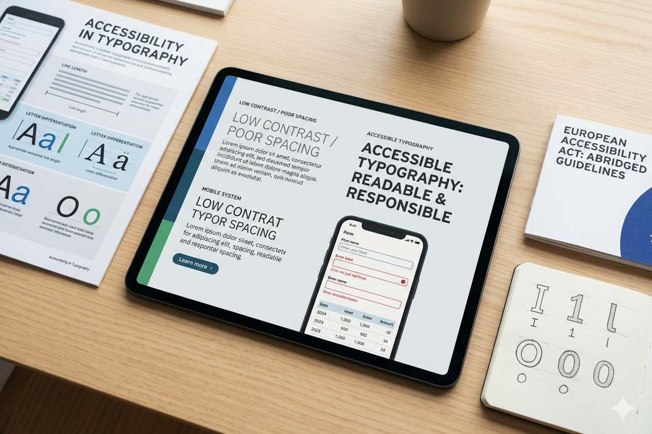
Accessibility is changing typography from a matter of taste into a matter of responsibility. Modern accessibility discussions focus not only on contrast ratios but also on adequate font size, appropriate letterforms, flexible presentation, and how text performs across devices. Growing accessibility requirements and regulations, including the European Accessibility Act, have prompted many digital teams to pay closer attention to readable text, and the conversation is expanding beyond compliance checklists.
For designers, this means typography decisions now carry both product and legal implications. A font that looks elegant in a brand presentation may still fail users if it becomes too small, too compressed, too low contrast, or too difficult to read in real-world situations.
Why Accessibility Is a Typography Issue
Typography shapes access to information. Letterforms, spacing, line length, contrast, hierarchy, and responsiveness all affect whether people can read content comfortably. Accessibility is not solved by choosing one special font. It requires a system that supports different users, devices, and viewing conditions.
This is especially important for public services, finance, healthcare, education, and global commerce. In these sectors, unclear typography is not only a design flaw; it can prevent users from completing essential tasks.
From Contrast to Reading Conditions
Many teams begin with color contrast because it is measurable. But reading conditions include more than foreground and background. Line length affects eye movement. Tight tracking can make small text harder to distinguish. Extremely thin weights may disappear on lower-quality displays. Decorative details can reduce clarity in interface labels.
Accessibility-oriented typography, therefore, requires testing. Designers should examine body text, captions, forms, navigation, error states, tables, and mobile views. The most important failures often appear in small, repetitive UI elements rather than in large marketing headlines.
Where Accessibility Problems Usually Appear
| Context | What to test | Common risk |
|---|---|---|
| Forms and error states | Labels, helper text, validation messages. | Small type, low contrast, or unclear hierarchy. |
| Tables and dashboards | Numerals, column headers, dense rows. | Compressed spacing and hard-to-compare figures. |
| Mobile navigation | Menu labels, buttons, search fields. | Thin weights and tight touch environments. |
| Legal and support content | Long paragraphs, notes, instructions. | Fatigue caused by poor line length or line height. |
The Role of Typeface Selection
Typeface choice still matters. Open apertures, distinguishable characters, balanced x-height, clear numerals, and well-spaced punctuation can improve usability. A broad family with multiple weights allows hierarchy without relying only on color. Good technical production helps text render more consistently across platforms.
However, no font can carry accessibility alone. The same typeface can be accessible or inaccessible depending on size, contrast, line height, and context. This is why accessibility belongs in the design system, not only in the font selection meeting.
Example: Atkinson Hyperlegible
Atkinson Hyperlegible, created for the Braille Institute, is a useful real-world example because the font is explicitly designed for readers with low vision. Its value lies not only in a distinctive visual style, but also in clearer differentiation between commonly confused letters and numbers.
Use the example to show that accessibility can be designed into letterforms. Still test the font in context: size, contrast, line height, and interface density remain essential.
Multilingual Accessibility
Accessibility also becomes more complex when a brand works across scripts. Latin, Cyrillic, Greek, Arabic, and other writing systems have different structures and spacing expectations. A multilingual identity must preserve readability in every supported script, not only in the primary market.
Studios such as TypeType offer Cyrillization and multilingual font services, reflecting a broader industry need: accessible brand typography has to travel across languages. Teams can explore relevant font and service options when planning multilingual systems.
What It Means for Designers
Designers should build accessibility tests into typography approval. Do not approve a typeface only in large, ideal specimens. Test it at minimum sizes, in dense UI, with real names and numbers, on mobile screens, and in the languages the brand will actually use. Keep line length, line height, contrast, and hierarchy in the same conversation as style.
The future of typography will still include expressive lettering, experimental display fonts, and emotional brand voices. But the baseline expectation is changing: if people cannot read it, the design is not finished. Accessible typography is not a separate checklist at the end of a project; it is part of the core design decision.
How Accessibility Changes Approval Workflows
Accessibility pressure is changing how typography is reviewed. A design team can no longer present only the most attractive desktop view and expect approval. Stakeholders increasingly need to see mobile states, zoomed text, dark mode, error messages, tables, forms, and dense content before signing off on a type system.
This makes approval more practical and less subjective. Instead of asking whether a font looks beautiful in a brand deck, the team can ask whether real users can read it where the product actually communicates.
Approval Materials to Prepare
- A minimum-size text sample on mobile and desktop.
- A dense content screen with tables, forms, labels, and error messages.
- A dark mode or high-contrast test to see whether the product supports those states.
- A multilingual sample is one in which the brand uses more than one script or market language.
How to Balance Expressive Type and Readability
Accessible typography does not eliminate expressive design. It simply separates roles more carefully. A dramatic display face can still define a campaign, a landing page, or a brand moment, but body text, navigation, forms, captions, and instructions need a more robust typographic foundation.
The strongest systems allow emotion and readability to coexist. Display type can create personality, while text styles protect comprehension. This balance is especially important for brands that want to feel distinctive without excluding users in everyday product contexts.
Why Design Tokens Help Accessible Typography Scale
Design tokens make accessibility easier to maintain. Teams can encode type size, line height, weight, spacing, and responsive behavior into reusable variables, then test those values across products. When accessibility improvements are needed, the team can adjust the system rather than manually repairing every screen.
Tokens also help non-specialists apply typography correctly. Instead of choosing sizes and weights from memory, designers and developers can rely on approved values that have already been tested for readability, hierarchy, and consistency.
Token Decisions That Support Readability
| Token type | What it controls | Accessibility benefit |
|---|---|---|
| Font size | Approved sizes for each text role. | Prevents unreadably small ad hoc text. |
| Line height | Vertical rhythm for body copy and UI. | Improves scanning and reduces crowding. |
| Weight | Hierarchy and emphasis. | Avoids relying only on color to communicate importance. |
| Spacing | Tracking and paragraph spacing. | Keeps dense layouts legible across screens. |
What Clients and Design Leaders Should Ask
Clients and design leaders should ask better questions before approving typography. Does the system scale? Which scripts are supported? How does it behave on small screens? Does it work in forms, dashboards, invoices, and support content? Who owns the files, and what does the license allow?
These questions connect visual quality with technical, legal, and accessibility requirements. The strongest teams treat them as a single system rather than as separate approvals handled by different people at the end of the project.
Why Typography Knowledge Is Becoming a Strategic Skill
The change affects both education and professional practice. Young designers are being asked to understand formats, accessibility, licensing, and implementation much earlier than before. A portfolio that only shows beautiful compositions may be less convincing than one that explains how typography works in production.
For independent designers, this creates an opportunity to become more valuable. Clients need people who can evaluate tools, explain type choices, read licenses, and translate visual decisions into implementation rules. The market will reward clarity over novelty, because readable, well-produced, legally usable type systems remain essential even as tools and trends change.
Conclusion
Accessibility is reshaping typography from a purely aesthetic choice into a core component of user experience, compliance, and digital communication. Readable text depends on more than font selection alone; it requires thoughtful decisions about size, spacing, contrast, hierarchy, responsiveness, and multilingual support.
As accessibility standards continue to evolve, organizations that treat typography as part of a broader design system will be better positioned to create products that are inclusive, scalable, and easier to use. Whether designing a website, application, or brand identity, the goal remains the same: typography should help every user access information clearly and confidently.
Featured Image generated by Google Gemini.
Related Articles

June 8, 2026
How Data-Driven Web Design Elevates SEO and User Engagement
The relationship between digital aesthetics and search engine optimization has fundamentally shifted. For years, web design was largely subjective, driven by creative intuition and...
Read More
March 24, 2026
How can UX design influence adoption rates?
The insurance sector faces many persistent challenges in 2026, and the question usually boils down to increasing an app’s acceptance, trust, and adoption among users. With this key...
Read More
October 4, 2024
Reactive Web Design vs. Adaptive Design: Which is Right for Your Startup?
In today's digital landscape, creating a website that looks and functions flawlessly across a multitude of devices is paramount, especially for businesses seeking to establish a st...
Read More
Comments
Comments are available to signed-in users and are moderated to keep the discussion useful and respectful. Spam, automated submissions, and low-value promotional comments are removed. Outbound links may be approved when they are relevant and genuinely helpful to readers, but they are displayed as plain text rather than clickable hyperlinks.
No comments have been published yet.
Please sign in to submit a comment.